Enabling self-serve roaming activities on the My Telus app ✈️
Project Summary:
Overview:
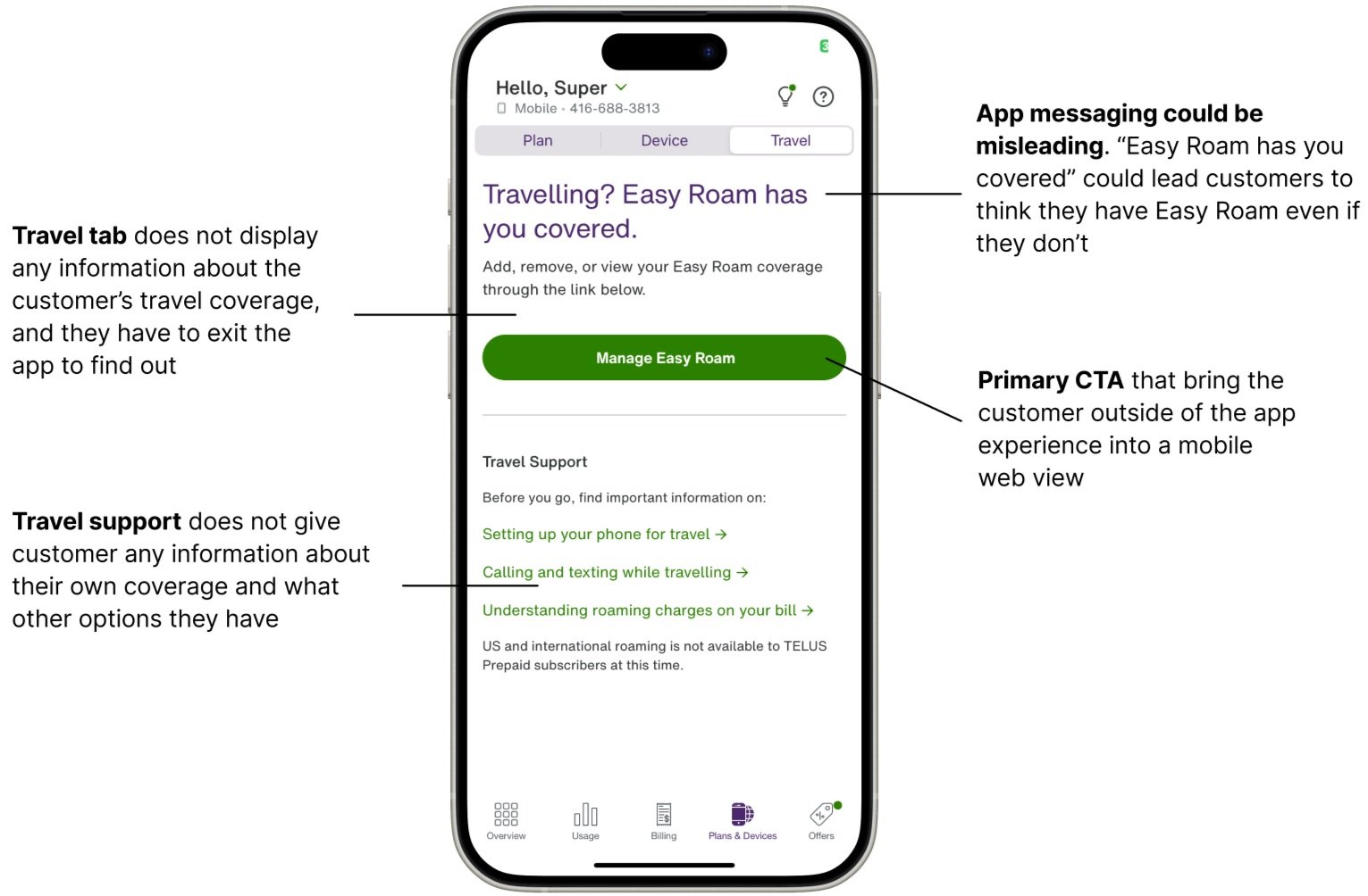
The My Telus travel experience on the app was a page that lacked information and self-service activities. Customers were expressing frustration with the single CTA available which brought them to a mobile-web view - taking them out of the app.
This project started from scratch with an in-app travel experience to allow customers to fulfill high value self-serve activities such as viewing current roaming coverage and purchasing other roaming services.
Role:
I was the product design prime who helped conduct user research and usability testing with my content designer. I worked with a product manager and 3 developers on this project.
Length: June 2024 to December 2024
Problem:
Our call centres were receiving a lot of customer complaints about our travel current experience which did not provide customers with any information about their coverage. Customers were calling to learn about the coverage included in their plans, deals & discounts, and to learn more about Easy Roam, Telus’ roaming feature.
Customer Goals:
Reduce call centre complaints about content findability on the app
Enable customers to learn more about Easy Roam options on their own
Make it easy for customers to purchase Easy Roam and similar products in the app
Business Goals:
Templated design for ease of use and consistency when the marketing team launches new promotions
Opportunities to entice customers to purchase Easy Roam over using local destination SIM cards
Consolidating content and design for web and app
User Research:
Competitive Analysis:
We looked at many different travel websites in order to better understand design patterns, interactions and purpose. We looked at Air Canada, AirBnB, and many others. We found that a lot of travel apps have very linear user flows, guiding the customer from point A to point B, we decided to emulate that within the My Telus app as well.
Wireframing:
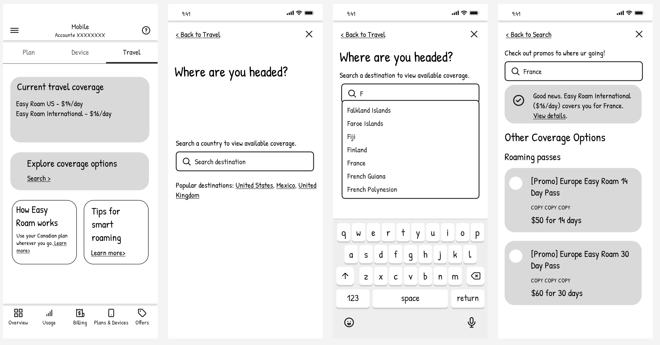
We went through multiple rounds of wireframing to discover designs that would address our customers’ concerns. The wireframes all follow two main goals: linear flow to guide customers in finding what they need and displaying essential information about Easy Roam.
Unmoderated User Research:
To begin the project, we kicked off with a round of user research with existing Telus customers who have traveled outside of the country within 90 days of the test. In this session we wanted to understand more about user behaviours and how they interact with roaming in general whether that be with Easy Roam, or with other roaming options.
We asked questions that would help us gather qualitative data, we wanted to know things such as:
What are some of the needs and expectations customers have with the app?
How do customers react to the current designs?
How might we evolve our MyTelus travel experience to fit our customers needs?
The customer feedback was that they:
The final design we decided on was a dashboard view of the customer’s current coverage within a carousel, and a search flow that enabled customers to search for a specific destination and find coverage options for their vacation spot. We added additional information about Easy Roam and how it works near the bottom of the screen so that it is still easily accessible albeit not the primary focus of the travel experience.
We ran through the designs through unmoderated usability testing two more times with the wireframes and with mid-fidelity designs to gather more feedback about the interactions and the visual design.
Participants rated the wireframes at a 4.6/5 stars, and the mid-fidelity designs at a 4.75/5 stars. Some notable quotes include:
“I think overall the experience is wonderful. I don't think there is anything lacking in this experience.”
“I think it's easy to use, to understand and all very intuitive.”
The Solution and Final Designs:
Home Screen:
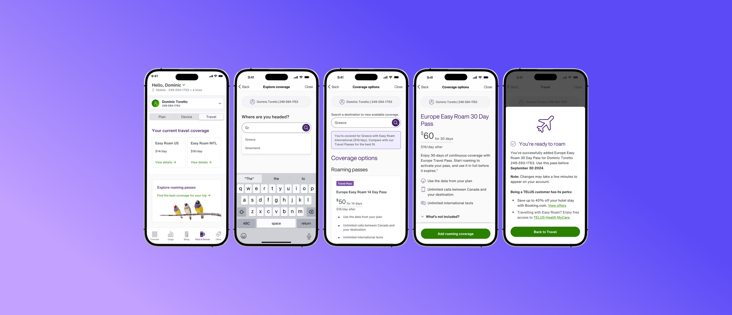
The home screen is the customer’s one stop shop all things travel. We included their current travel coverage as the primary area of focus as that’s what customers mostly called in about.Clicking on ‘view details’ will take customers to a product specific details page allowing them to learn more about their coverage and what it includes.
The second area of focus is the “Explore roaming passes” card which enables customers to search for a specific country and discover more roaming options within the travel flow.
Search screen:
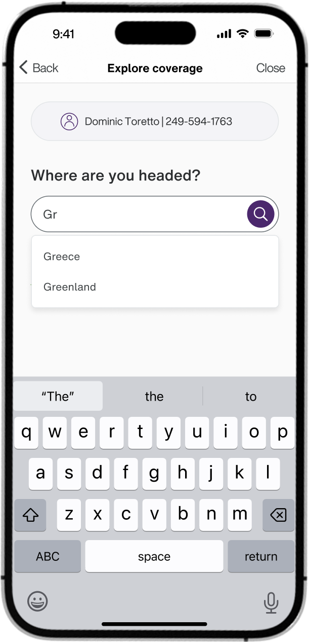
The search screen is the first step to discovering more about Telus roaming options. We enabled smart search so that the customer can begin typing in a country and we will fill out the rest for them, making it quicker for them to find what they’re looking for. Once they fill out their destination, they will be able to see their coverage options.
Coverage options:
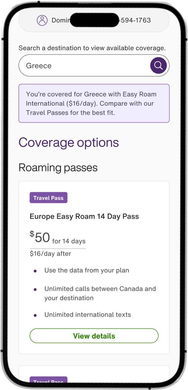
This is the screen that customers will spend the most time on, researching about the different coverage options that we have. If the customer already has Easy Roam with us, we will notify them and notify them that we have other Travel Passes available as well.
Here, our customers can quickly glance at the available options, what they offer, and compare pricing. Clicking on the ‘View details’ CTA will take them to the product details page.
Product Details Page:
On the product details page, customers can learn more about the roaming product and how the roaming passes work. There are certain business rules around how these passes work, so we use this space to clearly communicate to the customer of the roaming pass expiry date and how it long it lasts.
Clicking on “Add roaming coverage” will take customers to a confirmation screen.
Confirmation Screen:
Once a customer adds a roaming pass to their account, they will see the confirmation screen. On this screen, we clearly communicate to the customer that they are ‘ready to roam’ with this pass, as well as information about when to use the pass by.
We also want to display the perks that customers get when they get roaming passes with Telus to entice them to use our products over local destination SIM cards.
This concludes the customer’s purchase journey.
Data and Metrics:
We launched the My Telus travel app updates in December 2024, within 3 months of launch we’ve seen a significant rise in the number of high value self serve travel activities on the app. Over 38.4% of customers use the app to enable Easy Roam, to search for whether or not their vacation destination is covered, or to purchase roaming passes. We’ve sold over 15.3K Easy Roam passes within the app and profited $2.6 million CAD in Easy Roam sales. During the peak of the holiday season, we saw a record high of 192 Easy Roam passes sold in one day.
Accessibility Considerations
Simple flow:
Each step of the purchase is a new screen allowing customers to focus on one thing at a time, rather than multiple actions on a single screen
Descriptive copywriting:
All buttons are descriptive of what the next action may be to provide users with additional context of the next step
Touch targets:
The most important CTA is within reach at the bottom half of the screen. Supplementary but high value information, which customers might not tap on first, is presented in the top half
Reflections and next steps:
Reflections:
This project was one of the few projects I’ve done from the very start to the very finish. Working in a corporate world, a lot of projects are improvements on already existing designs. I’m very grateful to have had this opportunity to completely redesign something from scratch. Completing a project from end to end with so many stakeholders takes time and patience, and a lot of communication, I learned to better present my ideas to stakeholders and how to take business requirements into consideration while trying to maintain good user experience.
Next Steps:
We will continue monitoring the data and user feedback that comes in regarding the new My Telus app travel experience and continue iterating on our designs. We’d like to integrate a ‘travel planning’ tool within the app to help customers better plan out their trips and help them save money where they can. We will also continue collaborating with our stakeholders to help get their ideas to our customers hands.
